MAIP 2019 Art Direction Project
MAIP’s Art Direction challenge this year was to rebrand a musical artist I like, and design assets that could be used in their branding.
I chose to rebrand Miya Folick. Aside from being one of my favorite artists, she is pretty indie and a bit newer, so I felt as though I had a lot more creative freedom. Now let me clarify, I absolutely love Miya Folick, and realistically would not change her aesthetic at all. But I thought it’d be fun to explore an alternate possibility.
Below are a few examples of Miya’s look and vibe.


Her brand is very colorful and eccentric, but still relatable and genuine, using lots of muted colors and ‘in the raw’ shots. Her Instagram is very fun and honest.
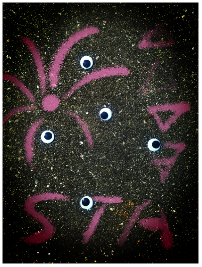
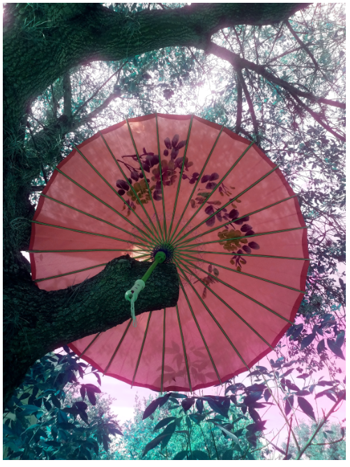
My challenge was to introduce a darker, more dangerous aesthetic. The key mood words I kept in mind were witchy, (sub)urban, and floral. With my design ideas, I tried to keep Miya’s love for more retro patterns and faded colors while accentuating her ‘goth’ side with darker tones and subject matter. I also included witchy elements to raise the intrigue factor while still keeping her as an artist with a cult following.
The mood images below (save the concert schedule) could all be used as backdrops for social media posts or ads. They convey an almost creepy vibe, with strong influences of mysticism, youthful rebellion, and traditional patterns.